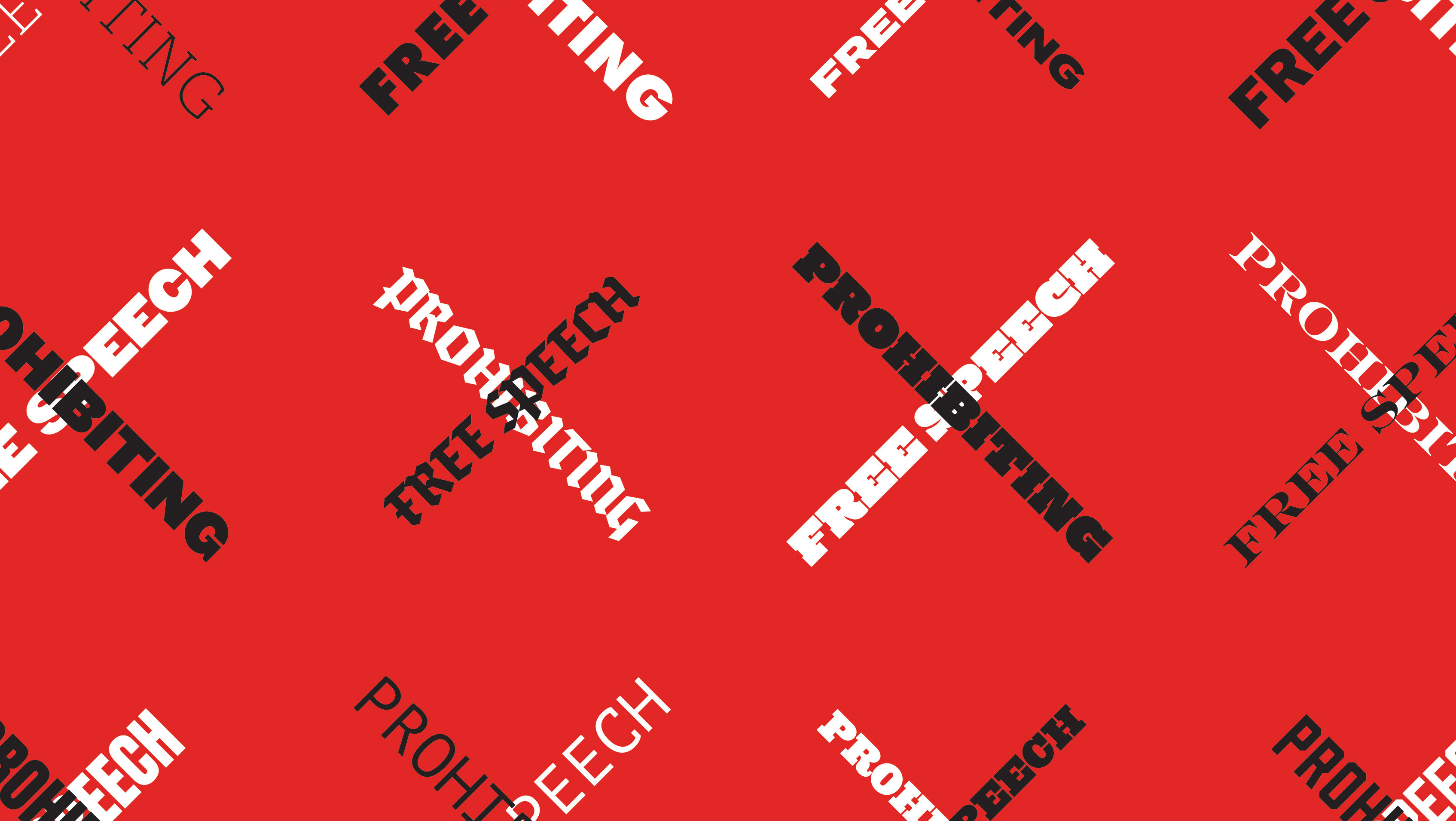


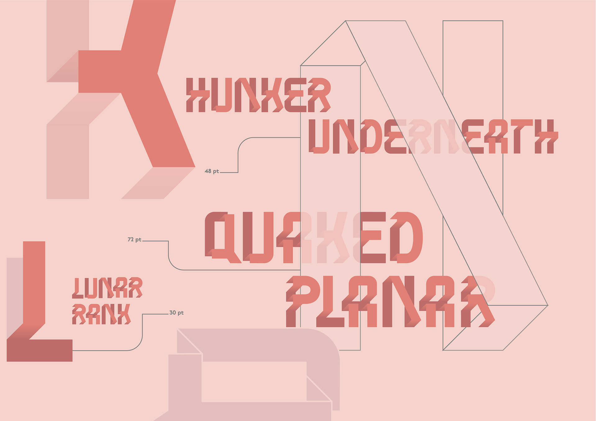
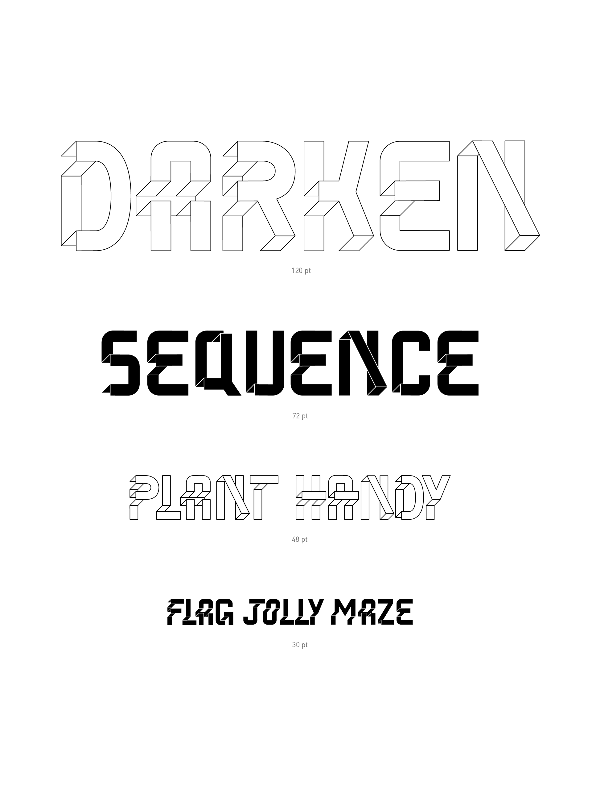
Type specimen pages demonstrating Planar Plunk's appearance at various point sizes and font styles.
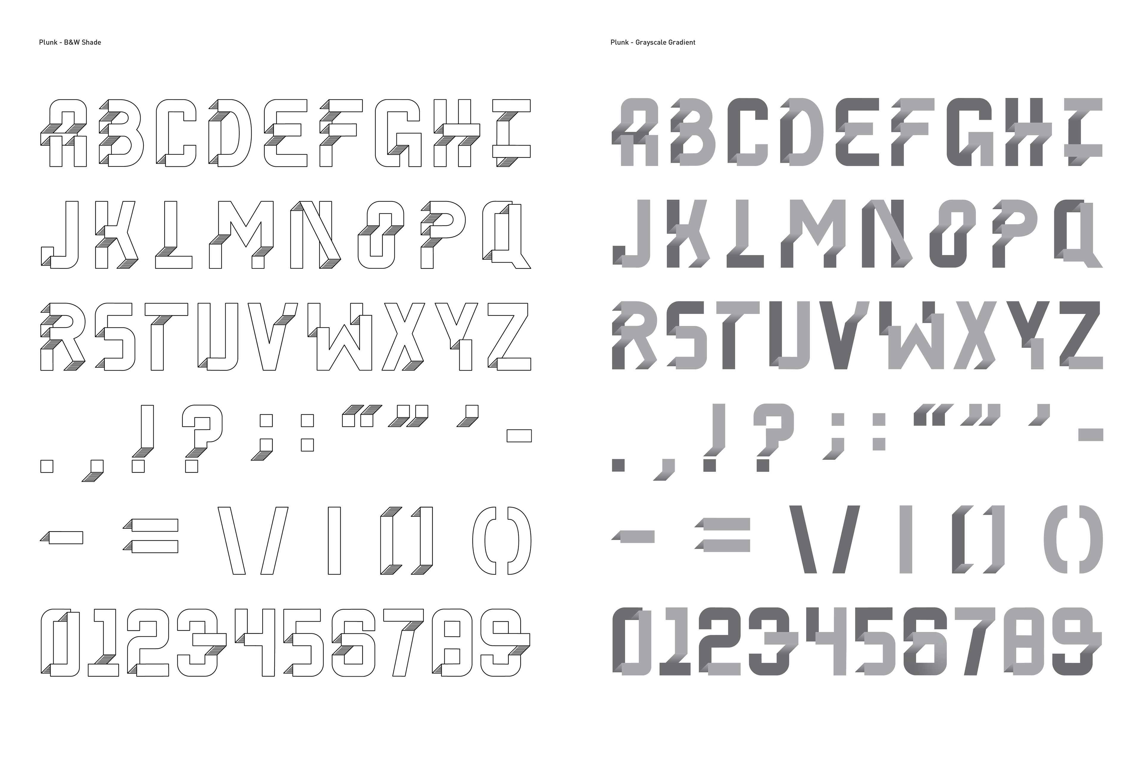
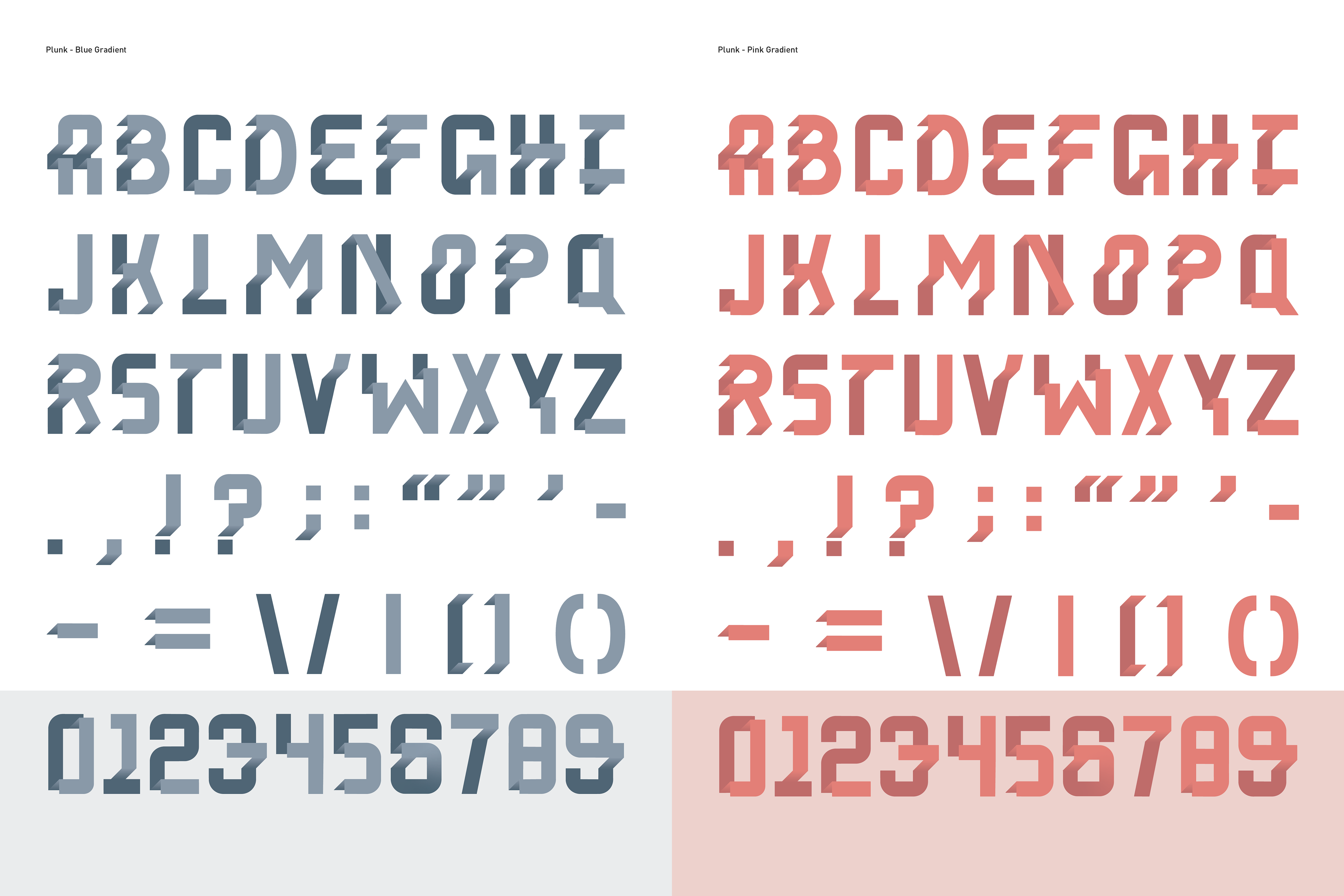
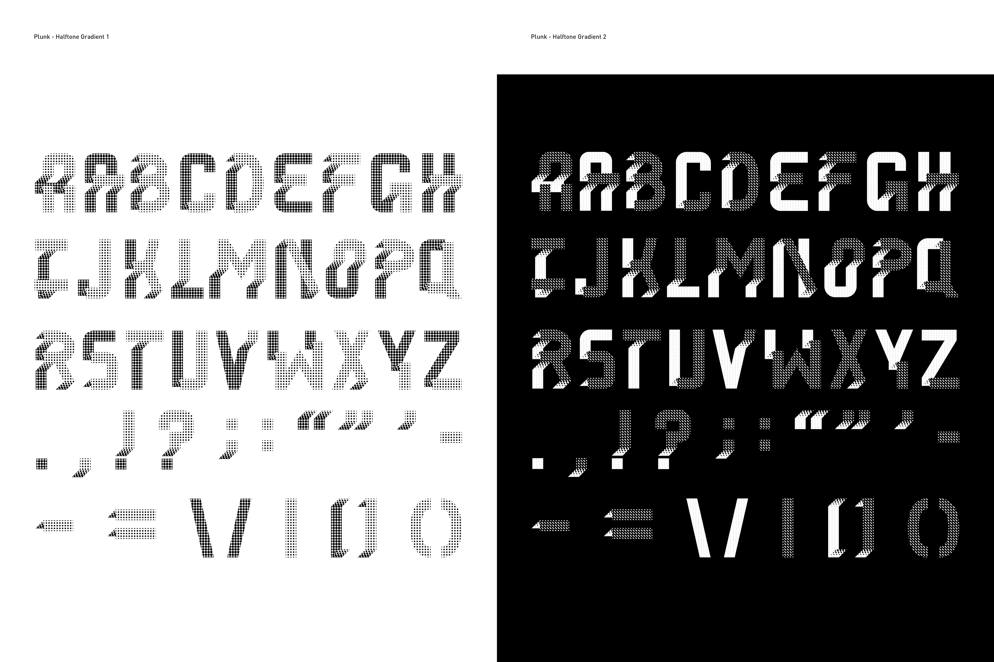
Below are the 8 font styles I created as a part of the Planar Plunk type family. The family includes an outline and fill version, three color gradients, and three alternative single-color options that mimic a gradient—one line-shaded and two halftones created from scratch. The single-color gradient options were created so that when the typeface needed to be translated to different materials and when using different print techniques, such as screen or Risograph printing, the dimensionality of the typeface would be maintained and allow for more versatility. Each font also includes alternative letterforms for many of the characters.

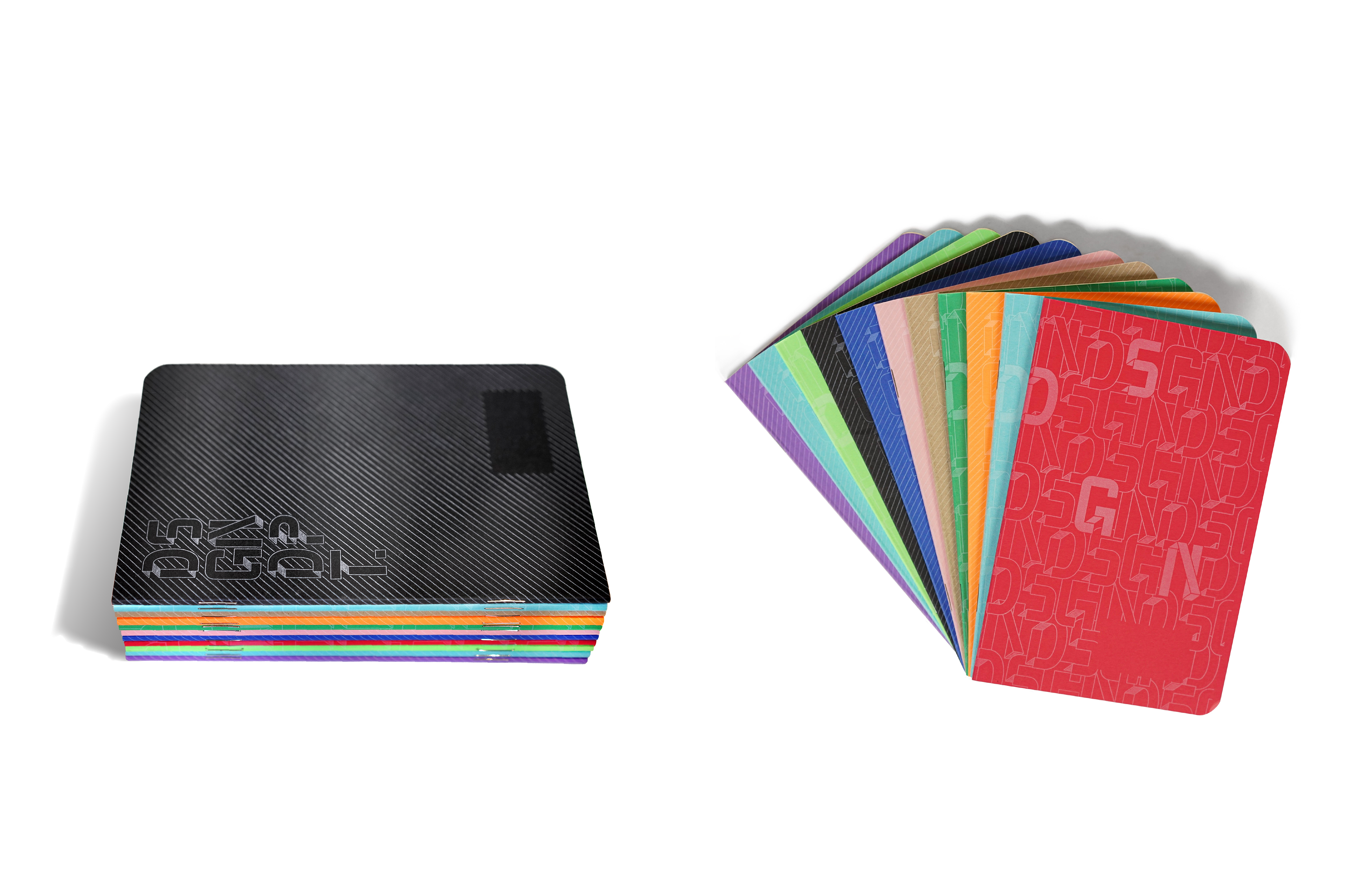
Blank page notebooks/sketchbooks created by the BYU Design Department Team using my typeface, complimenting line pattern, and stacked logo mark. These were handed out to students starting their programs as a welcoming gift along with other swag to increase excitement.
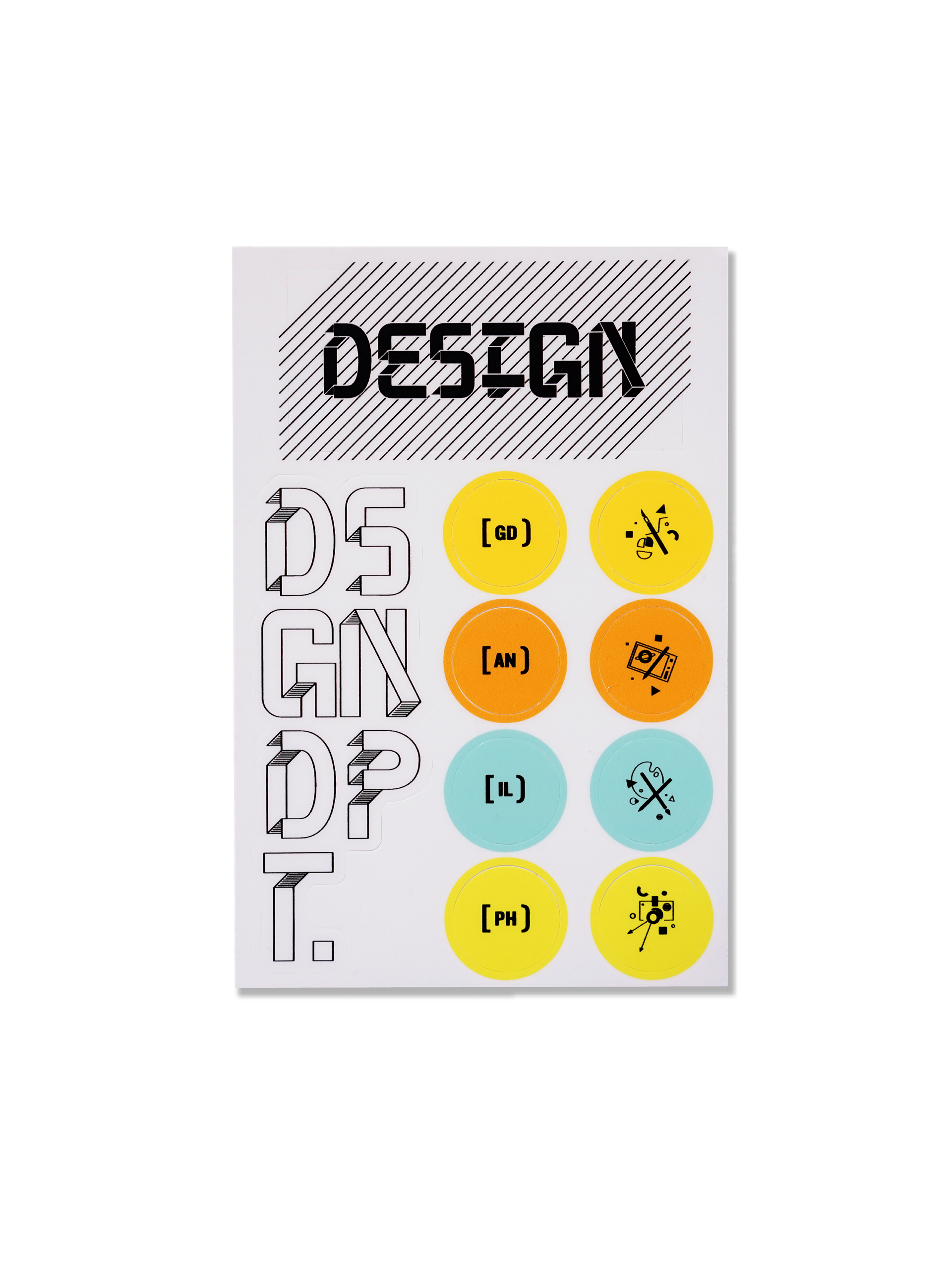
Vinyl stickers created by Design Department Team (circle stickers not my design)
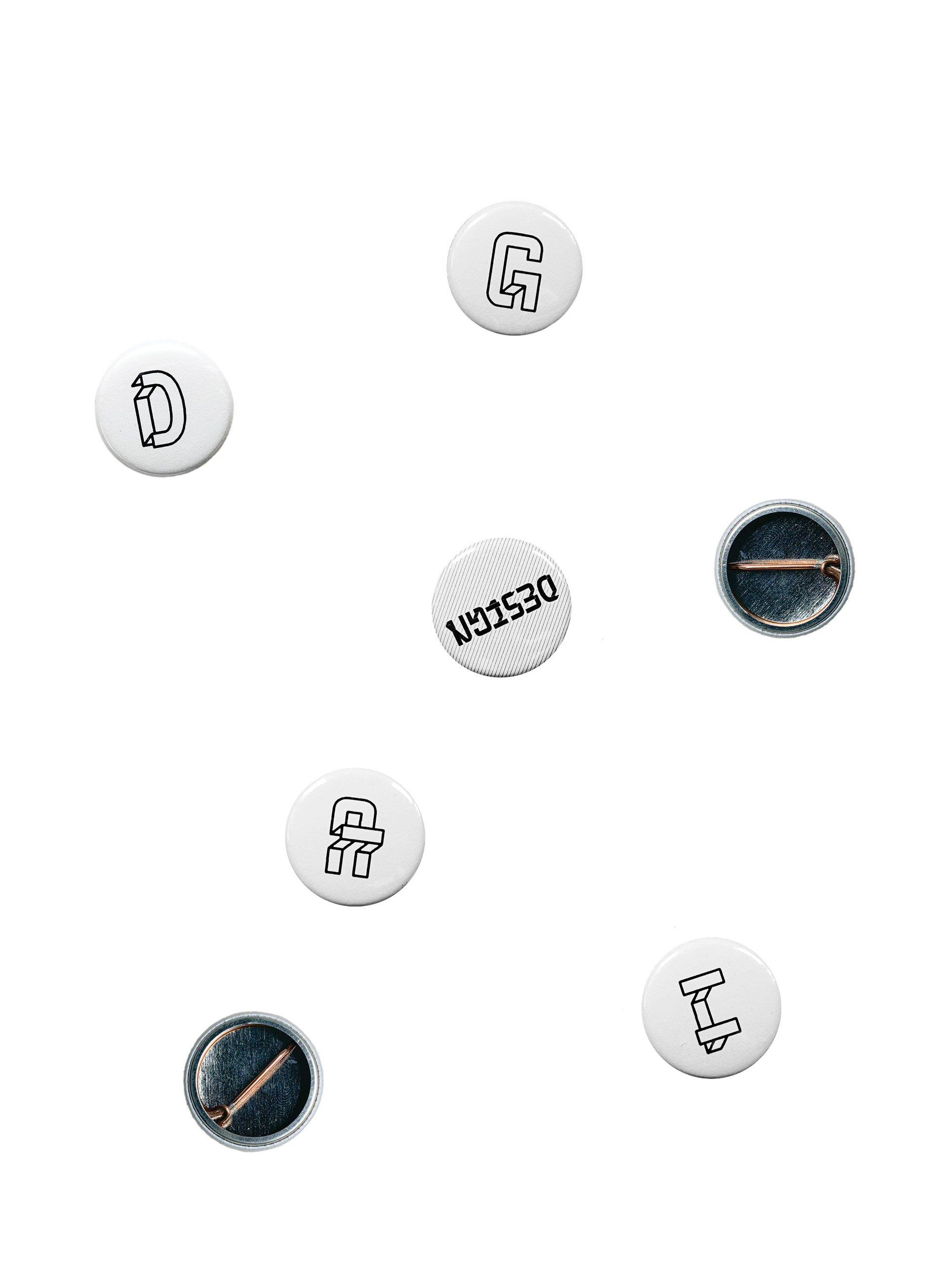
Buttons featuring various letters and other designs using my typeface for handout
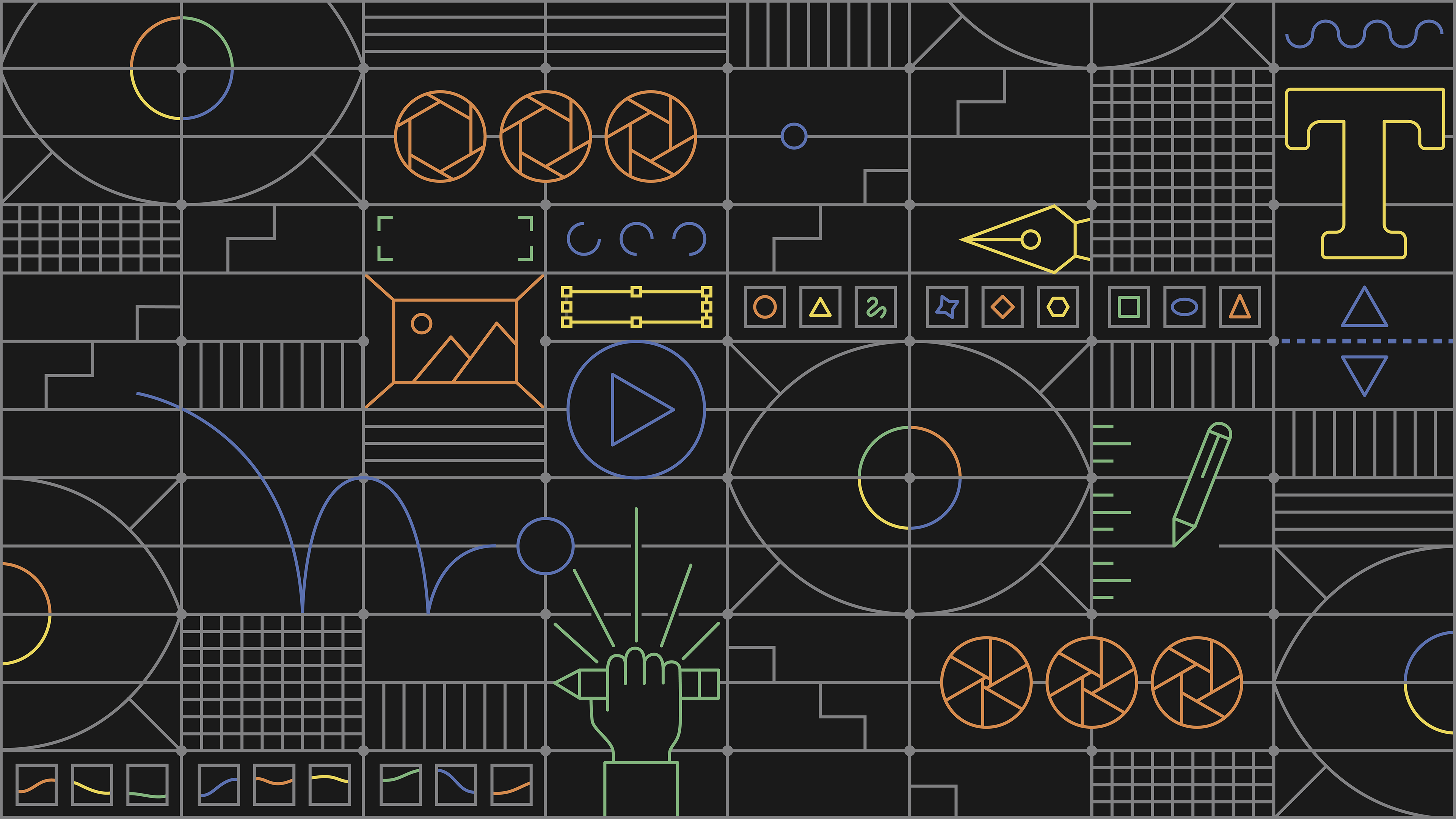
In addition to my typeface, I created complementary graphic elements for use in the Design Department 2020 Branding. The line quality of the graphic coordinates with the line quality found in my typeface, creating a cohesive branding. The display below depicts the common theme of "learning to see" that all unites all the programs in the design department. Aspects of illustration, photography, animation, and graphic design were included in the graphic to represent each of the programs. Similarly, the four colors each represent one of the majors. Other elements of the line-art design were drawn from details in the Harris Fine Arts Center building where the department is located—such as the tiled floor built on a grid, long hallways of artwork, and focal-point staircases.

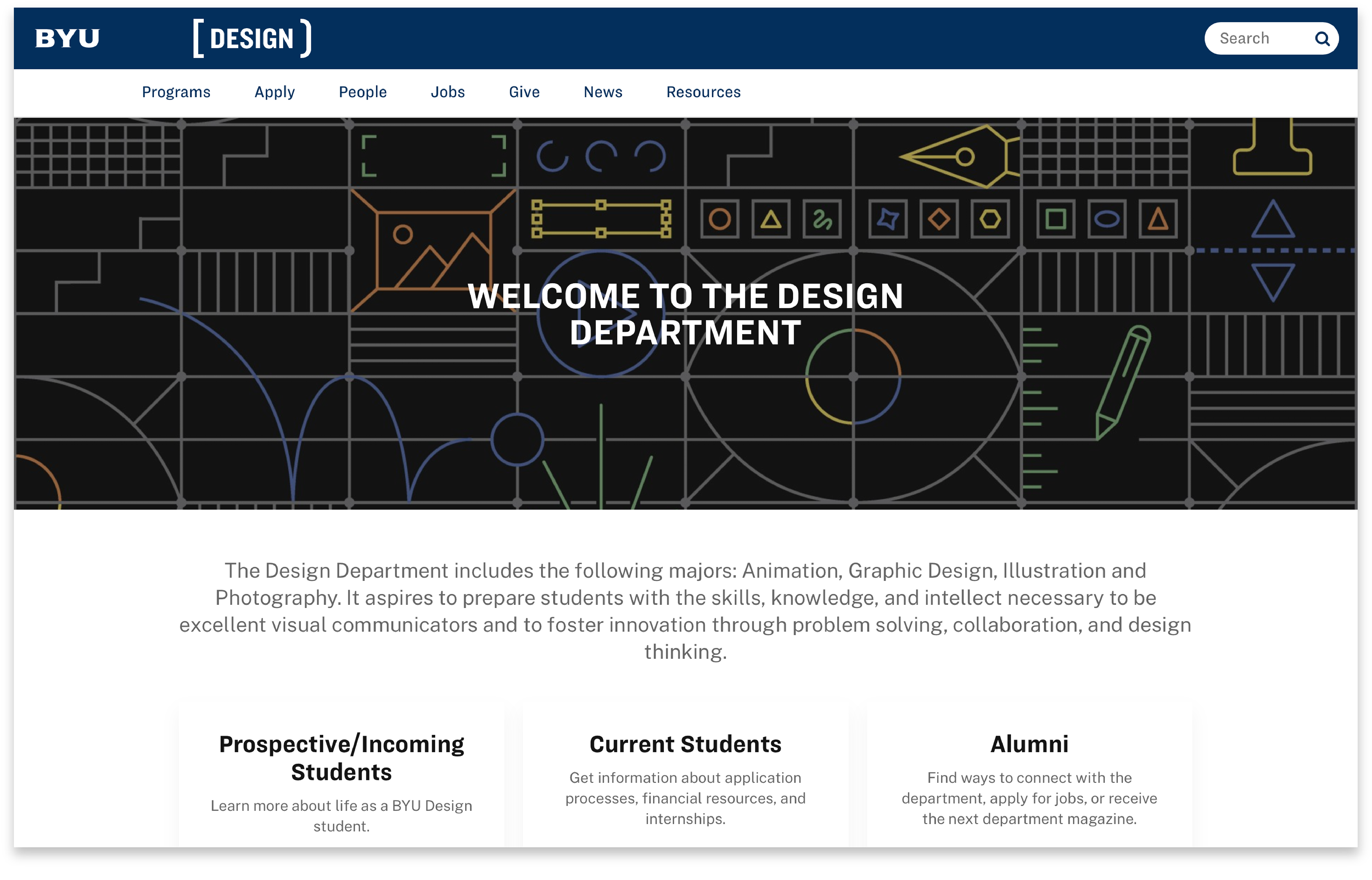
Screenshot showing one of the applications of the graphic on the Design Department homepage website
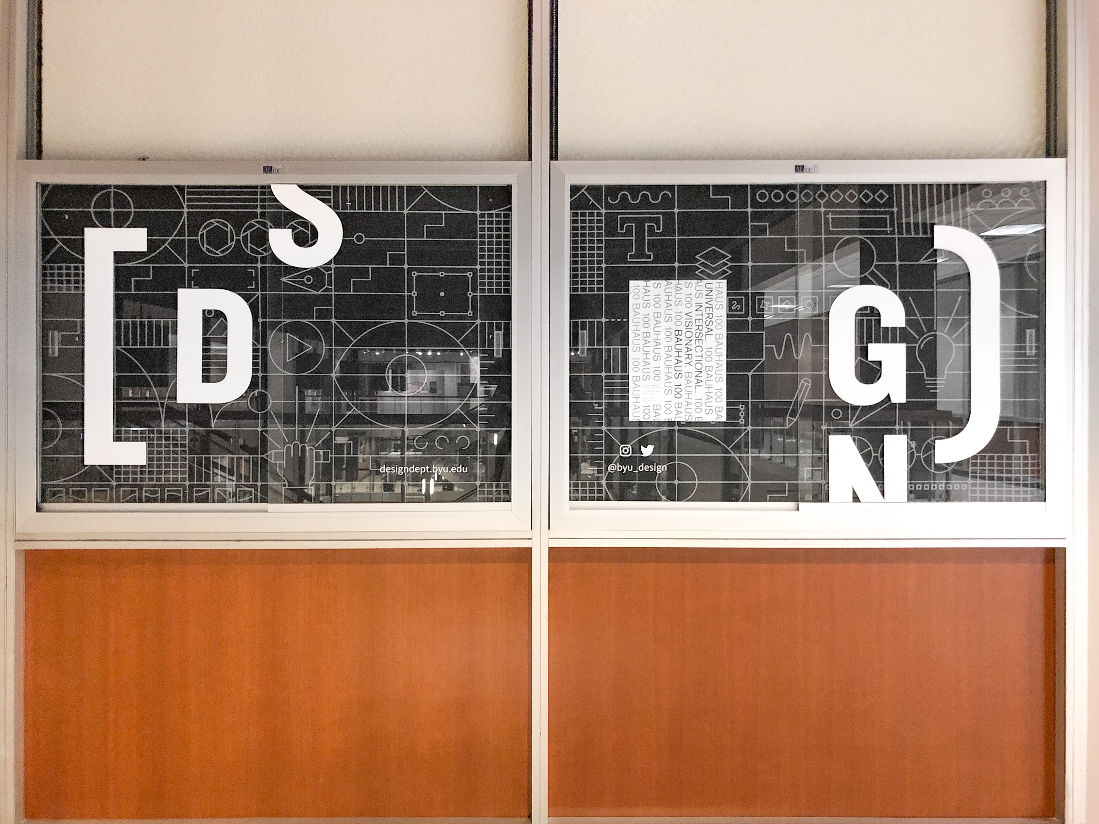
Second application of graphic: Glass display case outside of the main Design Department office in the HFAC where department announcements and other advertisements are hung. The black/gray colors were chosen because while the line design pops, it doesn't distract too much from the items that get placed on top of it. It measures approximately 100x35 inches.
If you are interested in using this typeface, please visit back in the near future as I am currently working on making it downloadable and it will be available soon. Thank you!